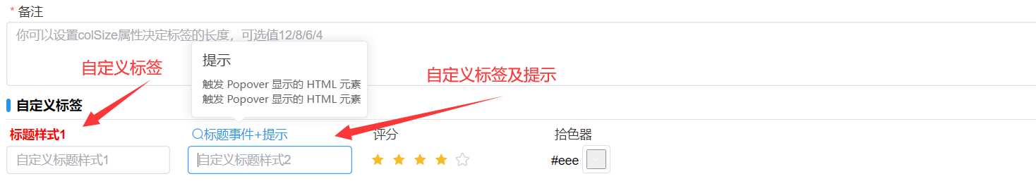
编辑表单自定义标签文本、标签点击事件
[vue3代码]写在生成的[表.vue]文件中,[vue2代码]写在[表.jsx]文件methods方法中;二选一实现
vue3 代码
const onInit=($vm)=> {
    gridRef=$vm
    const option = gridRef.getFormOption("字段");
    //只设置样式
    //option.labelStyle= "color:red;font-weight:700",
    option.labelRender = (h, {}) => {
     return (
      <div>
        <el-popover placement="top-start" title="提示" width="200" trigger="hover">
          {{
            reference: () => {
              return (
                <i
                  style="color:#2196F3;font-size:14px;"
                  onClick={($e) => {
                    proxy.$message.success("提示信息");
                  }}
                  class="el-icon-search" > 标题事件+提示 </i>
              );
            },
            default: () => {
              return (
                <div style="width:300px">
                  <div style="font-size:12px">触发Popover显示的HTML元素</div>
                  <div style="font-size:12px">触发 Popover 显示的HTML 元素</div>
                </div>
              );
            },
          }}
        </el-popover>
      </div>
    );
  };
}
vue2 代码
onInit() {
    const option = this.getFormOption("字段");
    //只设置样式
    //option.labelStyle= "color:red;font-weight:700",
    option.labelRender = (h, {}) => {
     return (
      <div>
        <el-popover placement="top-start" title="提示" width="200" trigger="hover">
          {{
            reference: () => {
              return (
                <i
                  style="color:#2196F3;font-size:14px;"
                  onClick={($e) => {
                    proxy.$message.success("提示信息");
                  }}
                  class="el-icon-search" > 标题事件+提示 </i>
              );
            },
            default: () => {
              return (
                <div style="width:300px">
                  <div style="font-size:12px">触发Popover显示的HTML元素</div>
                  <div style="font-size:12px">触发 Popover 显示的HTML 元素</div>
                </div>
              );
            },
          }}
        </el-popover>
      </div>
    );
  };
}