# 生成页面自定义组件扩展
此示例为在生成的页面中自定义扩展一些 vue 文件或弹出框(见上面【自定义弹出框】),可以配置任意你想配置的内容
# 1.gridHeader 位置自定义实现
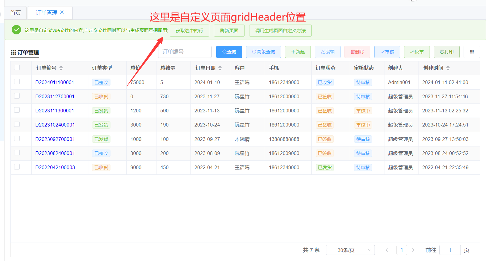
# 1-1.gridHeader 文件结构
# 1-2.gridHeader 代码实现
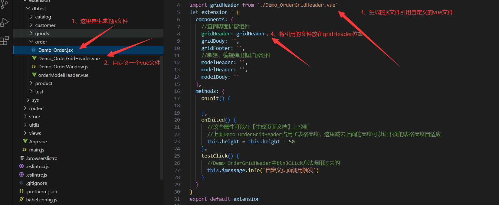
Demo_Order.jsx 对应的是你要操作的[表.jsx],非 vite 版本是[表.js] 生成页面文件:Demo_Order.jsx
import gridHeader from './Demo_OrderGridHeader.vue';
let extension = {
  components: {
    //查询界面扩展组件
    gridHeader: gridHeader,
    gridBody: '',
    gridFooter: '',
    //新建、编辑弹出框扩展组件
    modelHeader: '',
    modelHeader: '',
    modelBody: ''
  },
  methods: {
    onInit() {
      //生成页面访问自定义页面
      this.buttons.push({
        name: '自定义按钮', //按钮名称
        icon: 'el-icon-document', //按钮图标https://element.eleme.cn/#/zh-CN/component/icon
        type: 'primary',
        plain: true,
        onClick: () => {
          //调用自定义Demo_OrderGridHeader.vue的test方法
          // this.$refs.gridHeader可以调用自定义vue文件中的任意内容
          this.$refs.gridHeader.test();

          //其他自定义vue页面调用
          // gridBody: '',
          // gridFooter: '',
          // //新建、编辑弹出框扩展组件
          // modelHeader: '',
          // modelHeader: '',
          // modelBody: ''

          //上面这几个调用方式一样,this.$refs.gridBody获取自定义vue文件对象
          //modelHeader这三个只有在编辑弹出框打开后才能调用
        }
      });
    },
    onInited() {
      //这些属性可以在【生成页面文档】上找到
      //上面Demo_OrderGridHeader占用了表格高度,这里减去上面的高度可以让下面的表格高度自适应
      this.height = this.height - 50;
    },
    testClick() {
      //Demo_OrderGridHeader中btn3Click方法调用过来的
      this.$message.info('自定义页面调用触发');
    }
  }
};
export default extension;
1
2
3
4
5
6
7
8
9
10
11
12
13
14
15
16
17
18
19
20
21
22
23
24
25
26
27
28
29
30
31
32
33
34
35
36
37
38
39
40
41
42
43
44
45
46
47
48
49
50
2
3
4
5
6
7
8
9
10
11
12
13
14
15
16
17
18
19
20
21
22
23
24
25
26
27
28
29
30
31
32
33
34
35
36
37
38
39
40
41
42
43
44
45
46
47
48
49
50
自定义 vue 页面文件:Demo_OrderGridHeader.vue
<template>
    <el-alert :show-icon="true" :closable="false" type="success">
        这里是自定义vue文件的内容,自定义文件同时可以与生成页面互相调用;
        <el-button type="success" plain size="small" @click="btn1Click">获取选中的行</el-button>
        <el-button type="success" plain size="small" @click="btn2Click">刷新页面</el-button>
        <el-button type="success" plain size="small" @click="btn3Click">调用生成页面自定义方法</el-button>
    </el-alert>
</template>
<script lang="jsx">
//此处演示写的vue2语法,也可以改为vue3语法或者ts等
export default {
    data() {
        return {}
    },
    methods: {
        test(){
            this.$message.success('生成页面点击触发的')
        },
        btn1Click() {
            //通过  this.$emit('parentCall')获取生成页面$parent对象,
            this.$emit('parentCall', $parent => {
                let rows = $parent.getSelectRows();
                if (!rows.length) {
                    this.$message.error('请选中行')
                    return
                }
                this.$message.success(JSON.stringify(rows))
            })
        },
        btn2Click() {
            this.$emit('parentCall', $parent => {
                $parent.search();
            })
        },
        btn3Click() {
            this.$emit('parentCall', $parent => {
                $parent.testClick();
            })
        }
    }
}
</script>
1
2
3
4
5
6
7
8
9
10
11
12
13
14
15
16
17
18
19
20
21
22
23
24
25
26
27
28
29
30
31
32
33
34
35
36
37
38
39
40
41
42
43
2
3
4
5
6
7
8
9
10
11
12
13
14
15
16
17
18
19
20
21
22
23
24
25
26
27
28
29
30
31
32
33
34
35
36
37
38
39
40
41
42
43
# ------------------------
# 2.gridBody 位置自定义实现
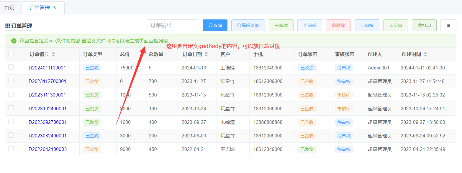
# 2-1.gridBody 文件结构
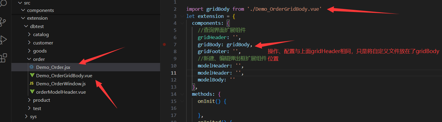
# 2-2.gridBody 代码实现
代码实现与上面的 gridHeader 操作相同
# ------------------------
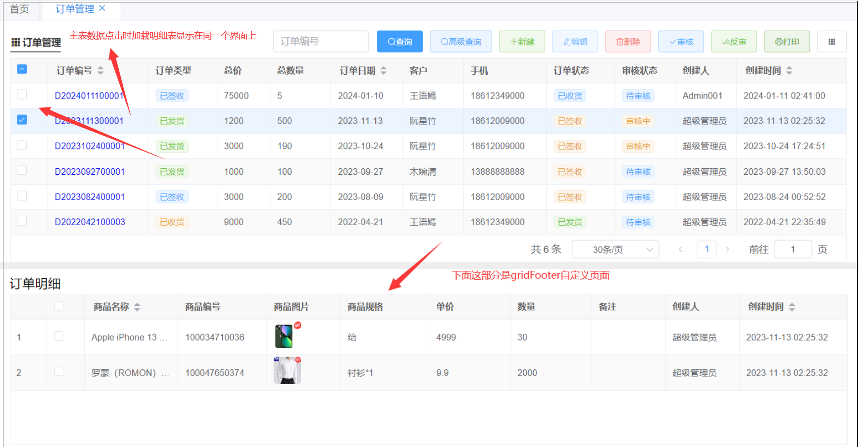
# 3.gridFooter 自定义实现(实战)
主表点击时加载明细表数据显示 代码实现与上面的 gridHeader 操作相同
# 3-1.gridFooter 文件结构
# 3-2.gridFooter 代码实现
Demo_Order.jsx 对应的是你要操作的[表.jsx],非 vite 版本是[表.js] 生成页面文件:Demo_Order.jsx
import gridFooter from './Demo_OrderGridFooter.vue';
let extension = {
  components: {
    //查询界面扩展组件
    gridHeader: '',
    gridBody: '',
    gridFooter: gridFooter,
    //新建、编辑弹出框扩展组件
    modelHeader: '',
    modelHeader: '',
    modelBody: ''
  },
  methods: {
    onInit() {},
    onInited() {
      //这里可以重新设置主表表格高度
      //this.height = this.height / 2
      //设置表格高度,减去下面明细表与表头的高度自适应
      this.height = this.height - 210 - 50;
    },
    rowClick({ row, column, event }) {
      //查询界面table点击行选中当前行
      //取消其他行选中
      this.$refs.table.$refs.table.clearSelection();
      //设置选中当前行
      this.$refs.table.$refs.table.toggleRowSelection(row);

      //调用Demo_OrderGridFooter.vue中明细表table的查询方法
      if (this.$refs.gridFooter) {
        this.$refs.gridFooter.gridRowClick(row);
      }
    },
    searchAfter(rows) {
      if (!this.$refs.gridFooter) {
        return true;
      }
      //主表查询加载数据后
      //页面加载或者刷新数据后直接显示第一行的明细
      if (rows.length) {
        this.$refs.gridFooter.gridRowClick(rows);
      } else {
        //主表没有数据时,清空明细数据
        this.$refs.gridFooter.clearRows();
      }
      return true;
    }
  }
};
export default extension;
1
2
3
4
5
6
7
8
9
10
11
12
13
14
15
16
17
18
19
20
21
22
23
24
25
26
27
28
29
30
31
32
33
34
35
36
37
38
39
40
41
42
43
44
45
46
47
48
49
2
3
4
5
6
7
8
9
10
11
12
13
14
15
16
17
18
19
20
21
22
23
24
25
26
27
28
29
30
31
32
33
34
35
36
37
38
39
40
41
42
43
44
45
46
47
48
49
自定义 vue Demo_OrderGridFooter.vue
<template>
    <div style="padding: 0 4px;border-top: 10px solid #eee;">
        <h3>
            <i class="ivu-icon ivu-icon-ios-information-circle-outline"></i>订单明细
        </h3>
        <div style="padding:10px;background: white;padding-top: 0;">
            <!-- 更多table配置见文档:http://v3.volcore.xyz/table 或使用element plus原生table -->
            <vol-table ref="table" :loadKey="true" :columns="columns" :pagination-hide="true" :height="220"
                :defaultLoadPage="false" @loadBefore="loadBefore" :url="url" :row-index="true"
                :index="false"></vol-table>
        </div>
    </div>
</template>

<script>
import VolTable from "@/components/basic/VolTable.vue";
export default {
    components: {
        VolTable
    },
    methods: {
        loadBefore(params, callback) {//表格数据加载时触发
            //更多table配置见文档:http://v3.volcore.xyz/table
            //   这里也可以设置一些查询条件
            return callback(true);
        },
        gridRowClick(row) { //主表点击行加载明细表
            if (this.$refs.table) {
                //load方法可参照voltable组件api文档
                this.$refs.table.load({ value: row.Order_Id, sort: "CreateDate" })
            }
        },
        clearRows(){
            //主表没有数据时,清空明细数据
            this.$refs.table.rowData.splice(0)
        }
    },
    data() {
        return {
            url: 'api/Demo_Order/getDetailPage',//指定从某个接口获取table数据
            //更多table配置见文档:http://v3.volcore.xyz/table
            //明细表格配置,从生成的vue文件中可以复制过来
            columns: [{ field: 'OrderList_Id', title: 'OrderList_Id', type: 'guid', width: 110, hidden: true },
            { field: 'Order_Id', title: 'Order_Id', type: 'guid', width: 110, hidden: true, align: 'left' },
            { field: 'GoodsId', title: '商品id', type: 'guid', width: 110, hidden: true, align: 'left' },
            { field: 'GoodsName', title: '商品名称', type: 'string', width: 120, align: 'left', sort: true },
            { field: 'GoodsCode', title: '商品编号', type: 'string', width: 120, align: 'left' },
            { field: 'Img', title: '商品图片', type: 'img', width: 100, align: 'left' },
            { field: 'Specs', title: '商品规格', bind: { key: '商品规格', data: [] }},
            { field: 'Price', title: '单价', type: 'decimal', width: 110,  edit: { type: '' }, align: 'left' },
            { field: 'Qty', title: '数量', type: 'int', width: 110, edit: { type: '' }, align: 'left' },
            { field: 'Remark', title: '备注', type: 'string', width: 100, edit: { type: '' }, align: 'left' },
            { field: 'CreateID', title: 'CreateID', type: 'int', width: 80, hidden: true, align: 'left' },
            { field: 'Creator', title: '创建人', type: 'string', width: 100, align: 'left' },
            { field: 'CreateDate', title: '创建时间', type: 'datetime', width: 145, align: 'left' },
            { field: 'ModifyID', title: 'ModifyID', type: 'int', width: 80, hidden: true, align: 'left' },
            { field: 'Modifier', title: 'Modifier', type: 'string', width: 130, hidden: true, align: 'left' },
            { field: 'ModifyDate', title: 'ModifyDate', type: 'datetime', width: 110, hidden: true }],
        }
    }
}
</script>
<style scoped>
h3 {
    font-weight: 500;
    padding-left: 10px;
    background: white;
    margin-top: 8px;
    padding-bottom: 5px;
}
</style>
1
2
3
4
5
6
7
8
9
10
11
12
13
14
15
16
17
18
19
20
21
22
23
24
25
26
27
28
29
30
31
32
33
34
35
36
37
38
39
40
41
42
43
44
45
46
47
48
49
50
51
52
53
54
55
56
57
58
59
60
61
62
63
64
65
66
67
68
69
70
71
2
3
4
5
6
7
8
9
10
11
12
13
14
15
16
17
18
19
20
21
22
23
24
25
26
27
28
29
30
31
32
33
34
35
36
37
38
39
40
41
42
43
44
45
46
47
48
49
50
51
52
53
54
55
56
57
58
59
60
61
62
63
64
65
66
67
68
69
70
71
# ------------------------
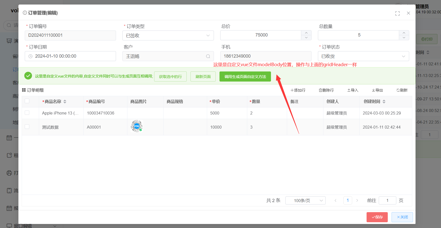
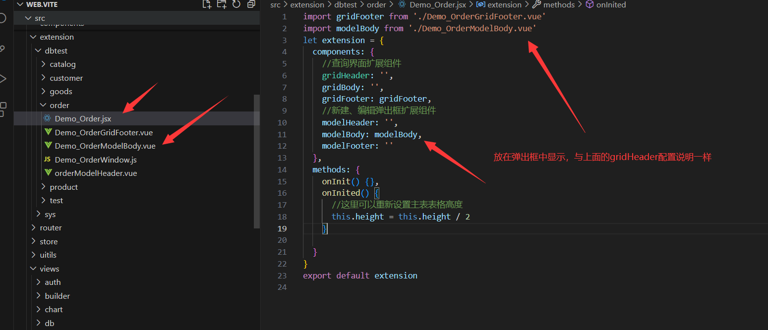
# 4.modelHeader、modelBody、modelFooter 自定义实现
操作与上面的 grid 三个位置是一样,model 这三个文件只是显示在弹出框里面
# 2-1.gridBody 文件结构
# 2-2.gridBody 代码实现
操作页面互相调用与上面的 gridHeader 一样,只是将 this.$refs.gridHeader改为this.$refs.modelBody,也可以参照上面的 gridFooter 配置
← 自定义弹出框 子父组件传值vuex全局缓存 →